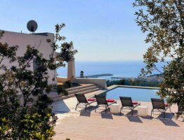
Virtuous examples in Puglia
In the interior design, colors matter more than a simple “a matter of chance”.
The choice of the shades of our furnishings affects our mood, quality of sleep and stress management.
It is important that the colors respect and reflect our tastes, be careful not to make the chromatic choices either too “intrusive” or too “irreversible”.
The design research of the last few years comes back to the importance of the shades of furniture and also to the importance of harmonic continuity between interior colors and exterior colors.
Here are some inspiration for interior design and color matching from some of our beautiful villas in Puglia, from the color of the walls to the periodically variable furniture “details” (such as pillows, home linens, ornaments and frames).
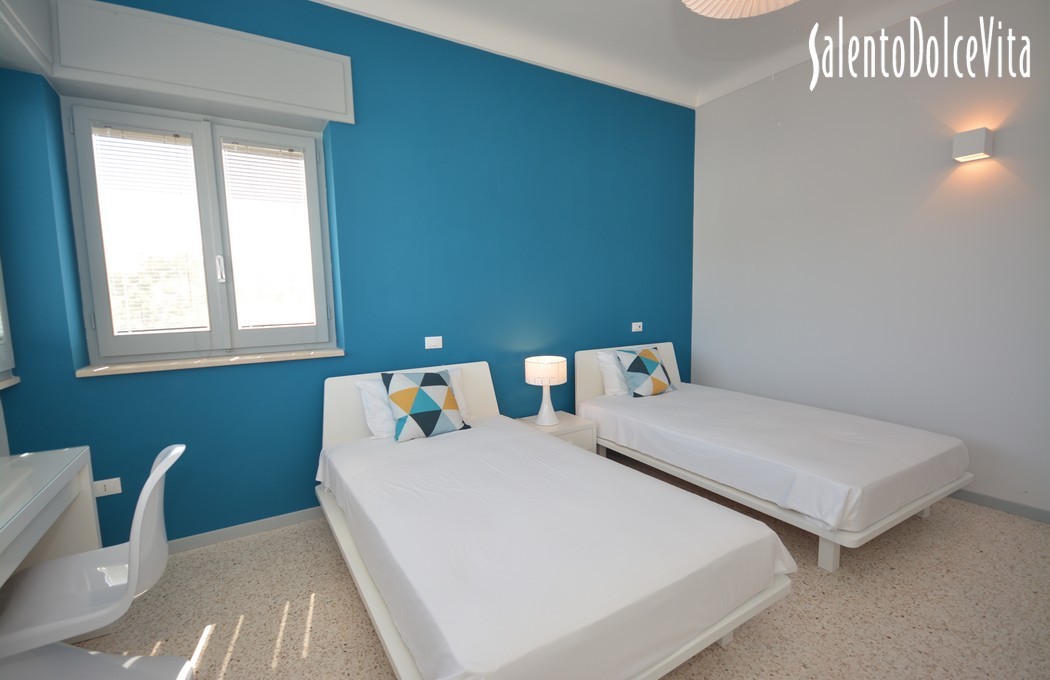
Keep calm and choose Green
It is not just a stereotype: green relaxes and helps in resting your mind. A prevalence of colors and shades of green in places where mental peace is more important than elsewhere, such as in a studio or in a children’s room, is the basic idea for anyone who wants to follow the chromatic design guidelines.
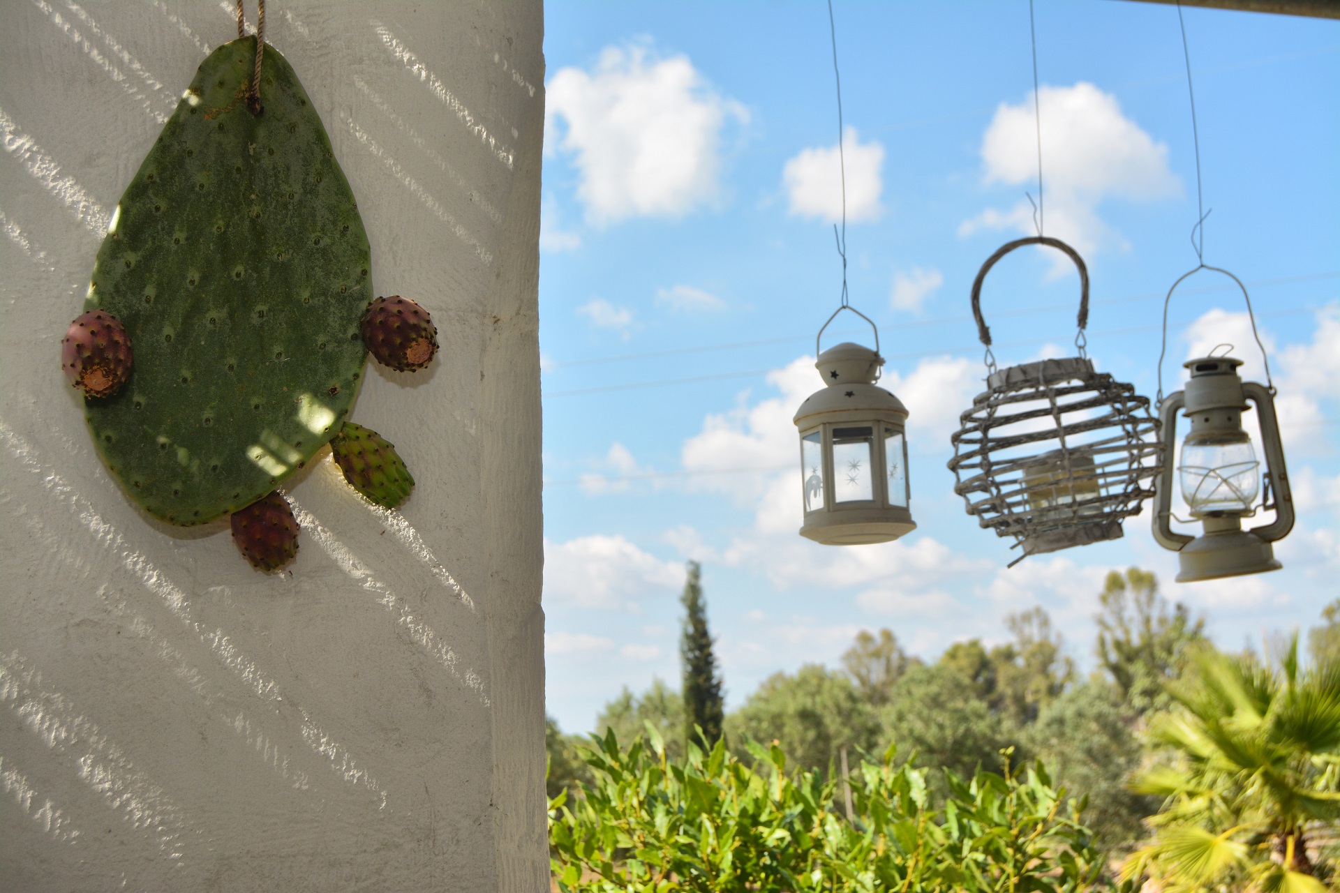
Greenery is also, typically, the shade of the exterior.
The continuity between inside and outside of green variations helps to find the right concentration
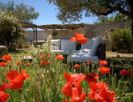
Red and brown earth
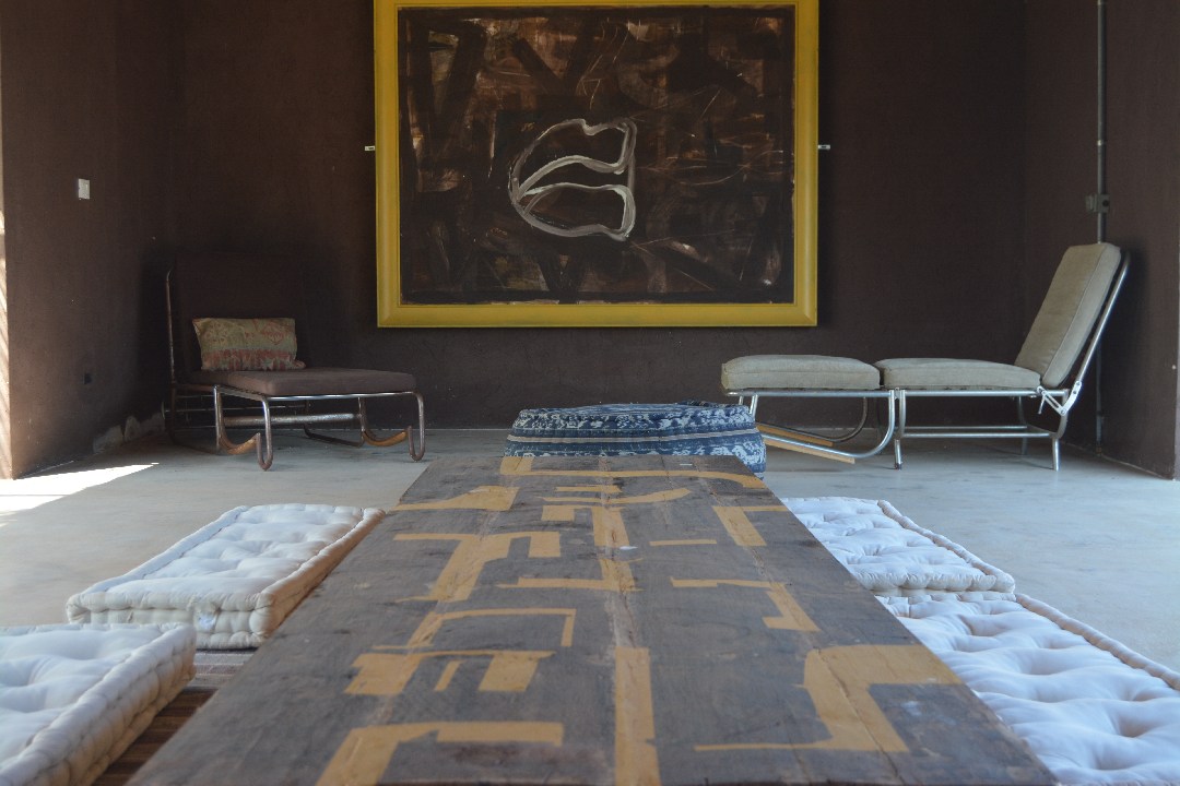
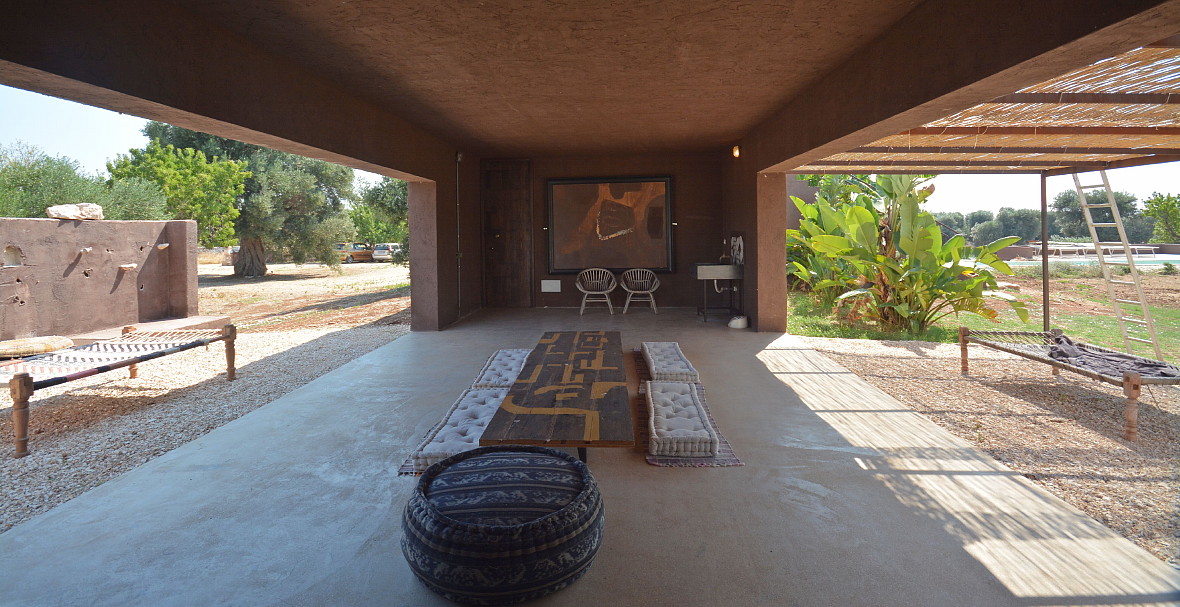

Exteriors, let’s remember, don’t just match the shades of green. Earth has its own weight in the chromatic balance.
Brown, raw wood color, shades of cherry, dark ebony, will take us back to the sense of well-being we felt last time we walked barefoot on the ground or the last time we embraced a tree.
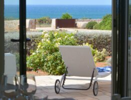
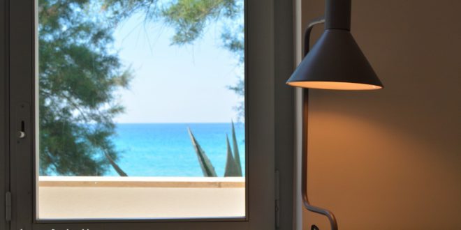
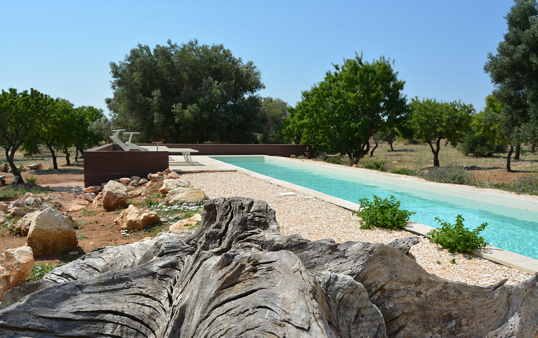
The importance of being blue
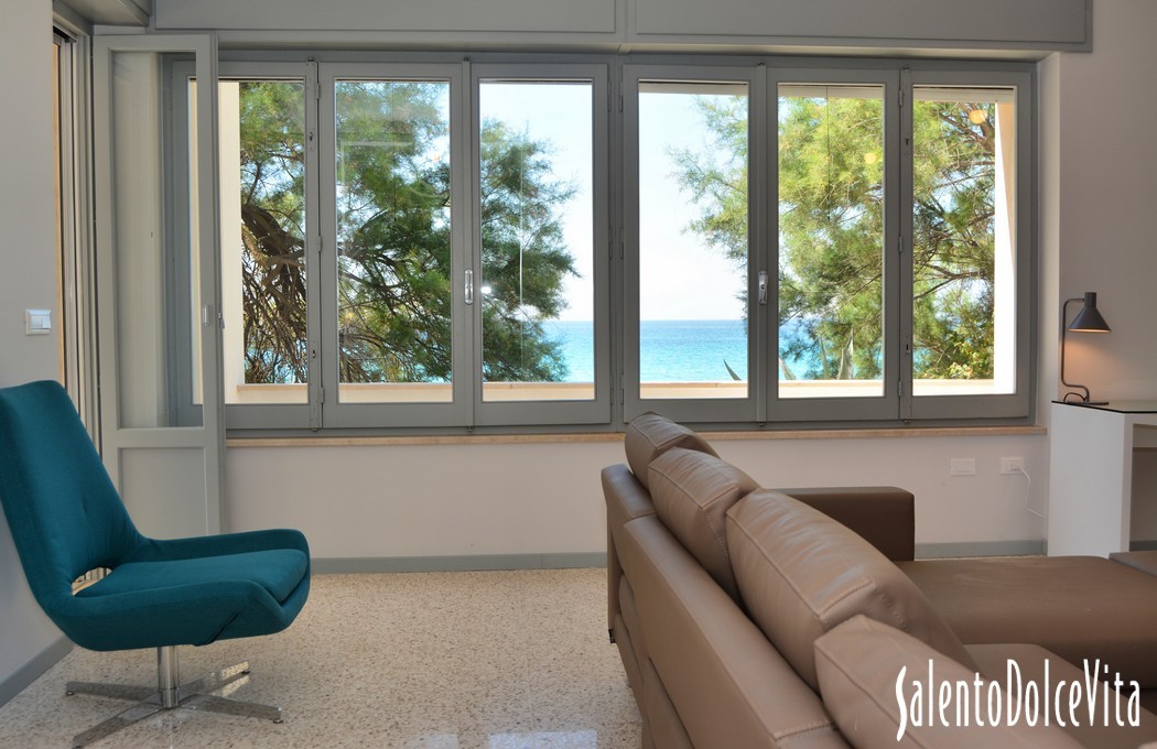
If the green helps us to relax, the shades of blue and turquoise tend to convey a sense of freshness and order.
For this reason they are especially indicated in living rooms, but also in the kitchen and in the bedroom.
For example, our beautiful Villa Turchese, in the Marina di Pulsano, in Puglia, plays all its concept on the turquoise nuances that accompany the view from the inside to the outside.
Continuity with external shades is also very important, and it is shown by the growing attention in this regard in interior design researches.
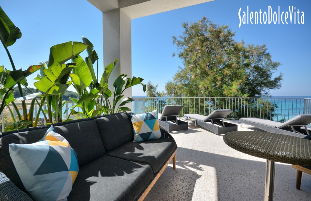
In our villa Turchese, the shades of cerulee creates a sense of continuity with the beautiful access to the sea visible from the terrace and most of the windows of the house.
Use of red wisely
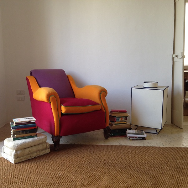
Marsala and cherry have been two major trend colors in recent years. And it is certainly not a secret that a red-tinted wall, coupled with details that recall its nuances (cushions, curtains, carpets), create a feeling of homely wellness and hospitality.
But it is important that the details in red are “reversible”, that is, easy to modify, because it is a tonality that might be tiring. If it is ideal in the winter months, it becomes complex in the good season.
White is the new black
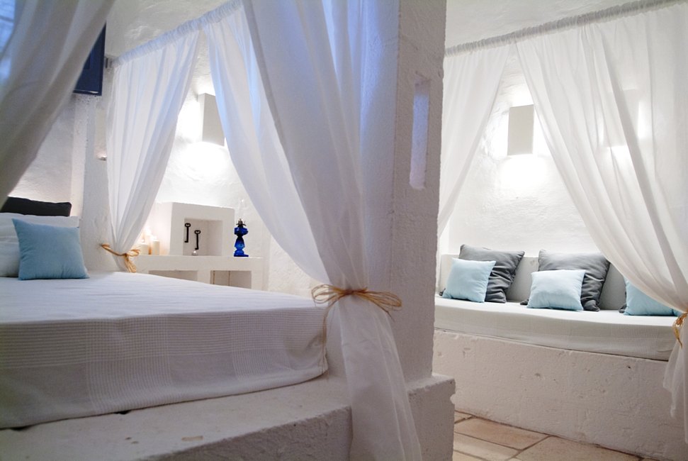
The importance of white has never been a secret to the Mediterranean latitudes, where lime and stone are often furniture elements.
you might also enjoy these villas made in stone and limestone in Salento
But it is not new either in the north, where total white and Hygge’s concept (ie home well-being) are happily married for ever.
To avoid making the white hues become pale and too cold, it is important to insert “soft” details such as drapes and curtains, insert floral motifs and use old materials such as wood and stone.
And what color do you give to your home and life?